ADS branding

A brighter, bolder brand and future for ADS
Refreshing the brand of the UK's powerful aerospace trade body.
The Brief
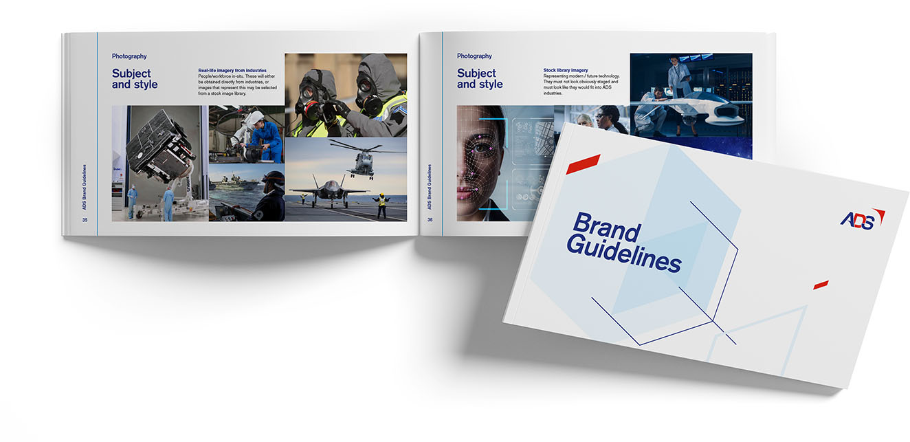
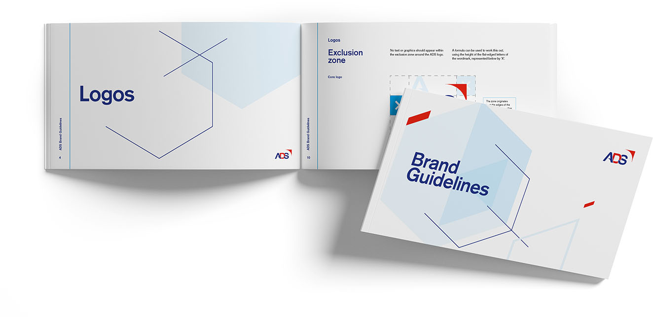
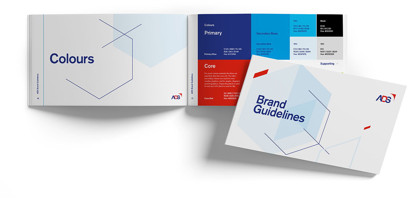
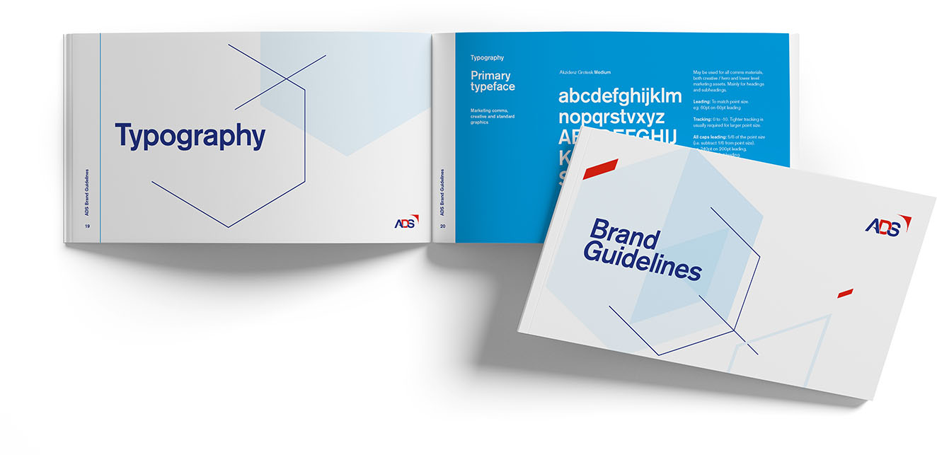
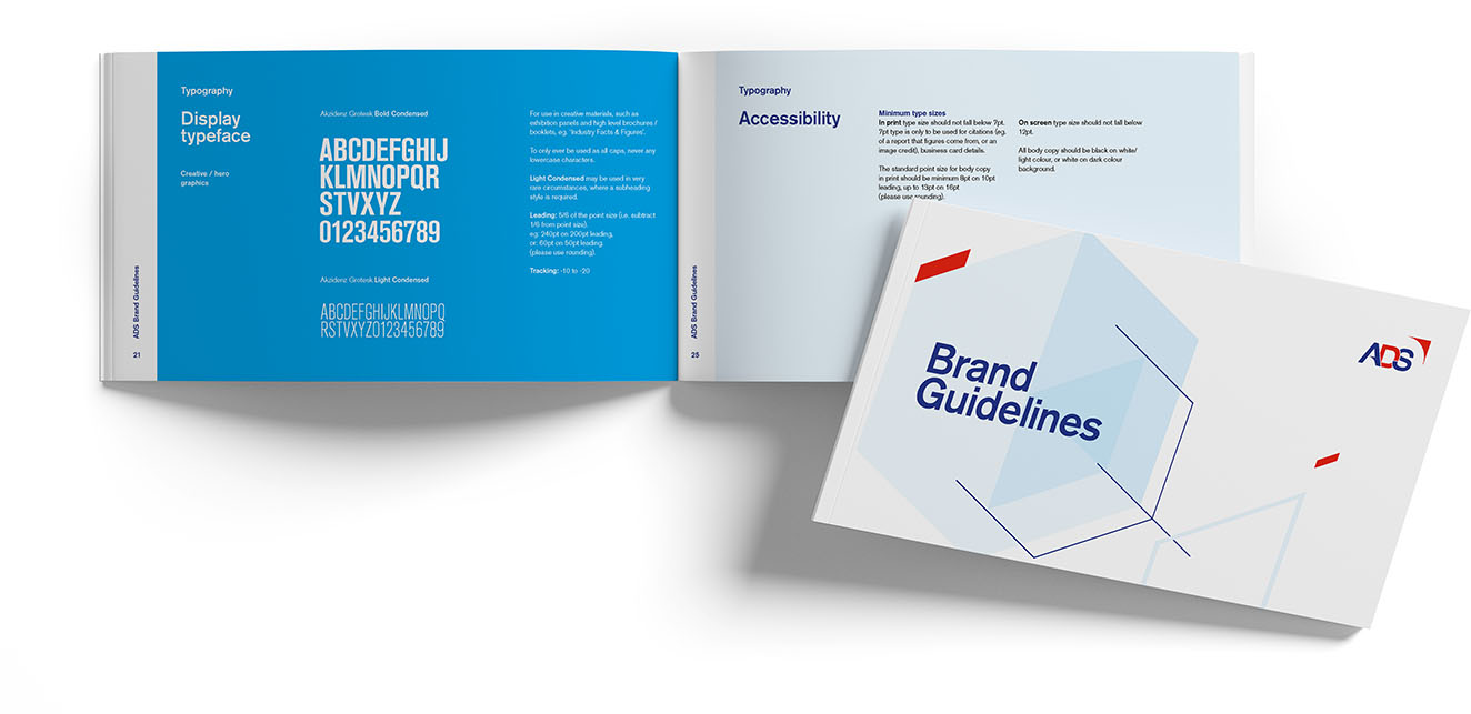
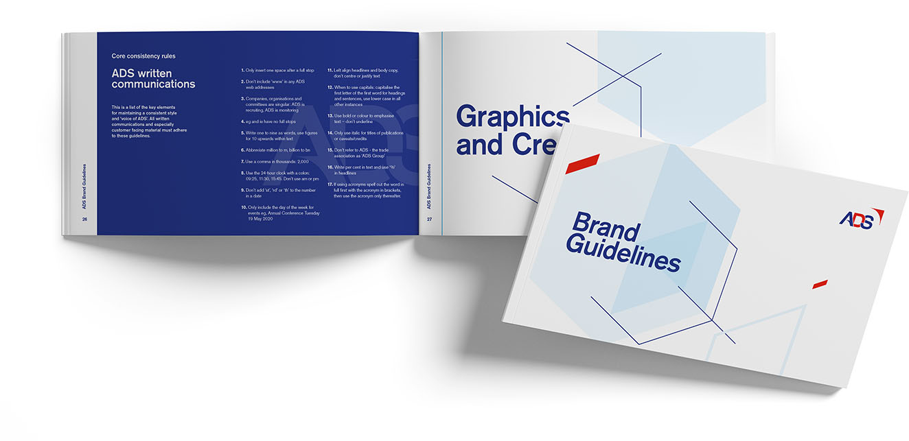
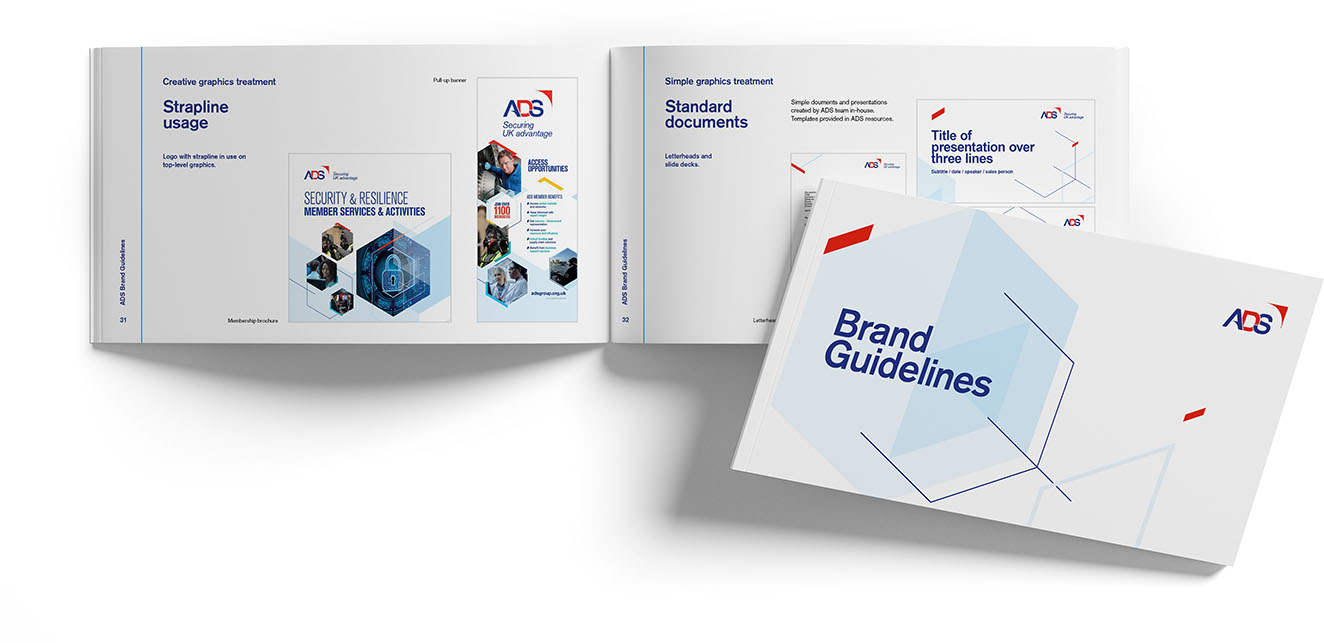
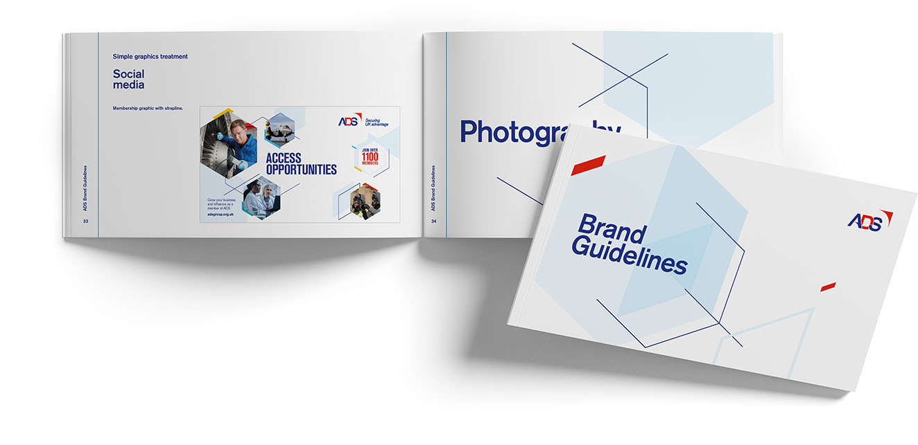
We were tasked with refreshing ADS's visual brand to better reflect their bold, outward-looking approach to global business.
How?
This was an evolution and we were careful to stay in touch with their existing brand.
After a discovery phase of research and interview to augment our already longstanding relationship with ADS, we visualised key concepts such as connection, motion, progress, positivity, openness and making to come up with the final visual language of the new brand that's now used across their trade show stands and all other communications.
Throughout this journey, your communication with our team meant we knew exactly what was going on, and where we were headed. ESA is thrilled and Astrolabe has been a very big success. Thank you for your exceptional expertise and experience.
WHY?
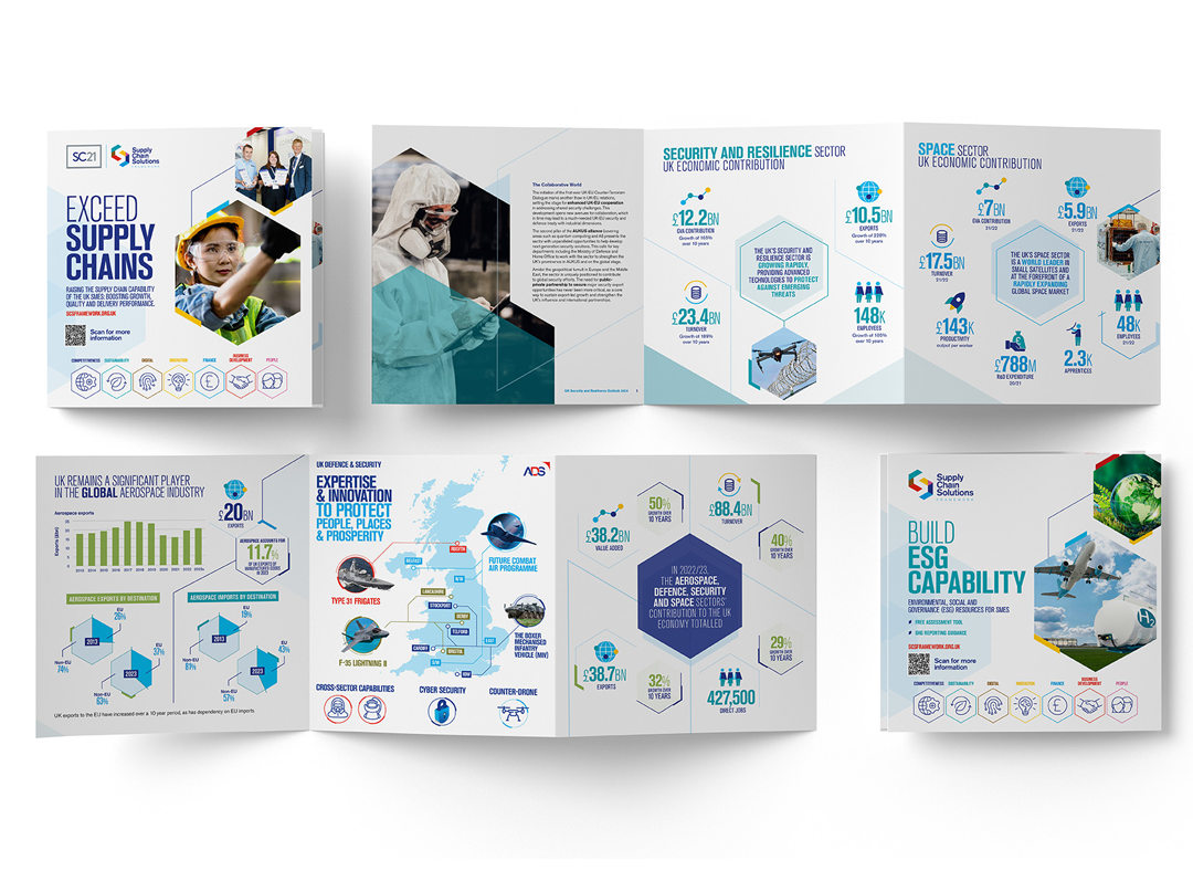
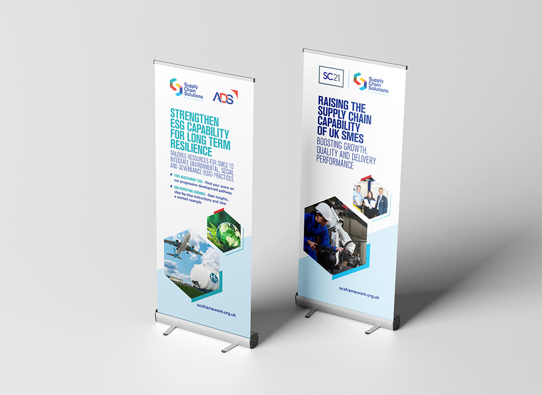
ADS is trade body to one of the UK's most exciting and successful sectors. By injecting colour and motion into their identity, we created a re-configurable visual brand fit for all channels.
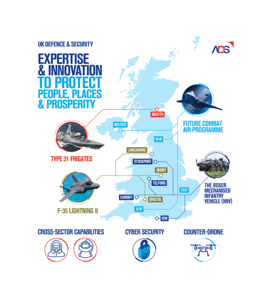
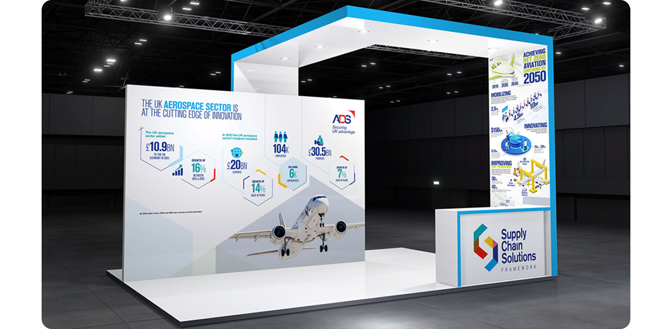
Capable of framing the vital stats and headline figures that best show off the industry's immense value, the new brand is also flexible enough to grow and change without breaking a sweat.
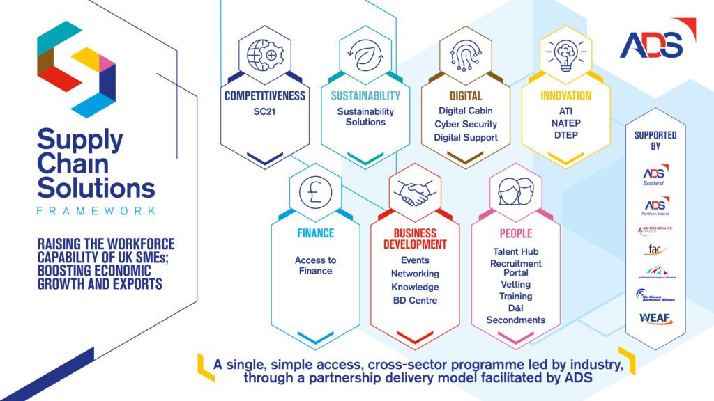
For example, the Supply Chain Solutions sub-brand we created is a perfect fit for the ADS brand language.
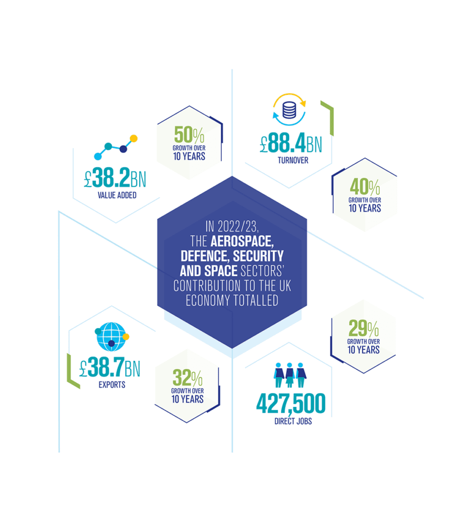
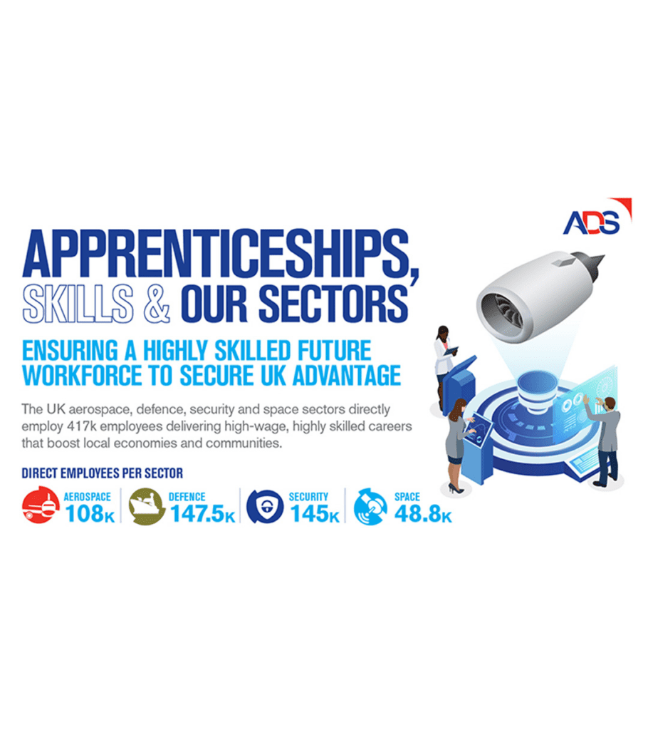
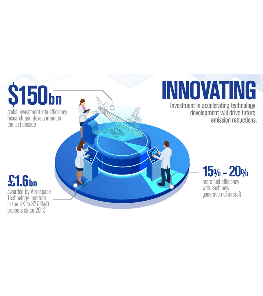

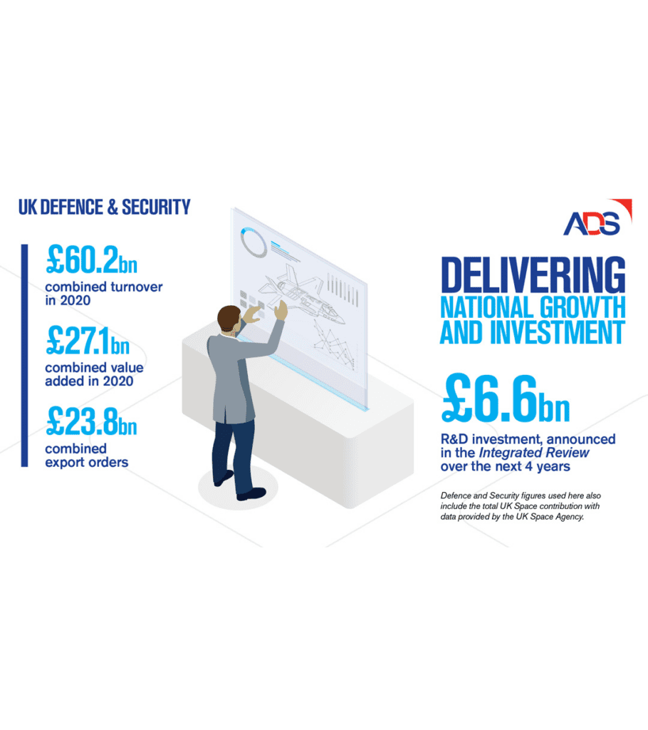
infographics
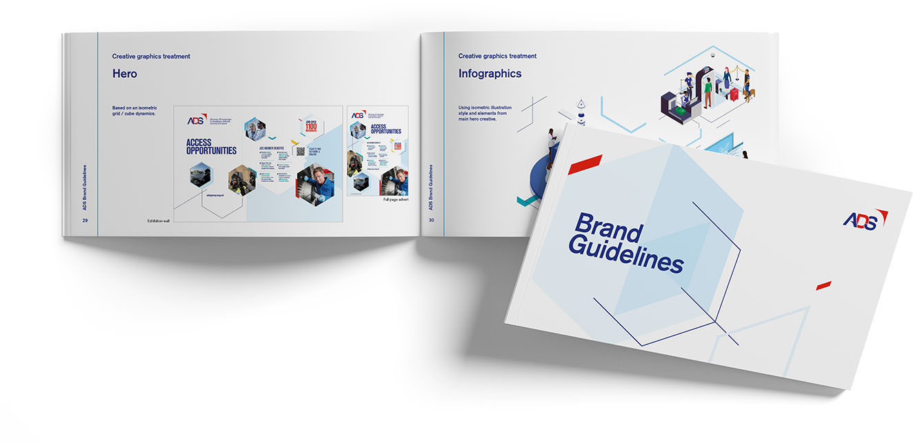
Numbers talk. ADS use facts and figures - often in the form of infographics - to make their case to business and government. Our highly illustrated, isometric illustrations live comfortably in the new brand.
Quick links
Quick links


