On the eve of major UK growth, SME specialist Breathe HR needed an urgent brand audit and a roadmap to a more inspiring offer.
The Brief
With major international backing, Breathe HR needed to step beyond their very narrow visual brand (the ubiquitous cloud shape) and staid messaging to deliver growth. Could we provide insight into their branding problems and give them an edge in a crowded market saturated with 'me-too' products?
Personas
scored
4 buyer personas analysed and scored against 5 pain points
Buyer journeys
revised
6-stage journey mapped with recommendations
Branding
clarified
Monolithic branding segmented by touchpoint and target
Messaging
developed
Brand promise, position, proposition, messaging and proof points
How?
We undertook a deep dive brand audit - comparing competitor positions, creating a matrix of persona interests, analysing the buyer journey, looking at textual and visual messaging, and reviewing the culture, vision, values, personality and story of Breathe's brand.
Having identified a huge disconnect between the bold vision of the company and the narrowly expressed benefits of the platform, we were able to visualise opportunities for creating brand value and better engaging Breathe’s target groups. Our extensive report enabled the incoming CMO to begin her work of transforming the company.
WHY?
Breathe's brand was 100% product-focused, but this plucky and positive SME had a great 'people' story to tell. As a result, their branding had become repetitive and their messaging felt transactional.
To fix this, we developed a solution that allowed their vision and values to shine through. Key to this was the audit, which revealed that, through 'brandable' human moments and much stronger messaging, they could differentiate themselves, create deliverable brand promise and engage potential buyers better.
TREND ANALYSIS
The facts
of buyers trust companies
0%
that are seen as authentic
increased effectiveness
0%
of ads with diverse casts in driving purchases
Thank you so much to you and the team for all your efforts. Your examples have brought a big smile to my face - we absolutely love what you produced and presented.
Head of Marketing, Breathe HR
Brand personality
The essence of Breathe is people, and the brand needed to authentically reflect that essential truth.
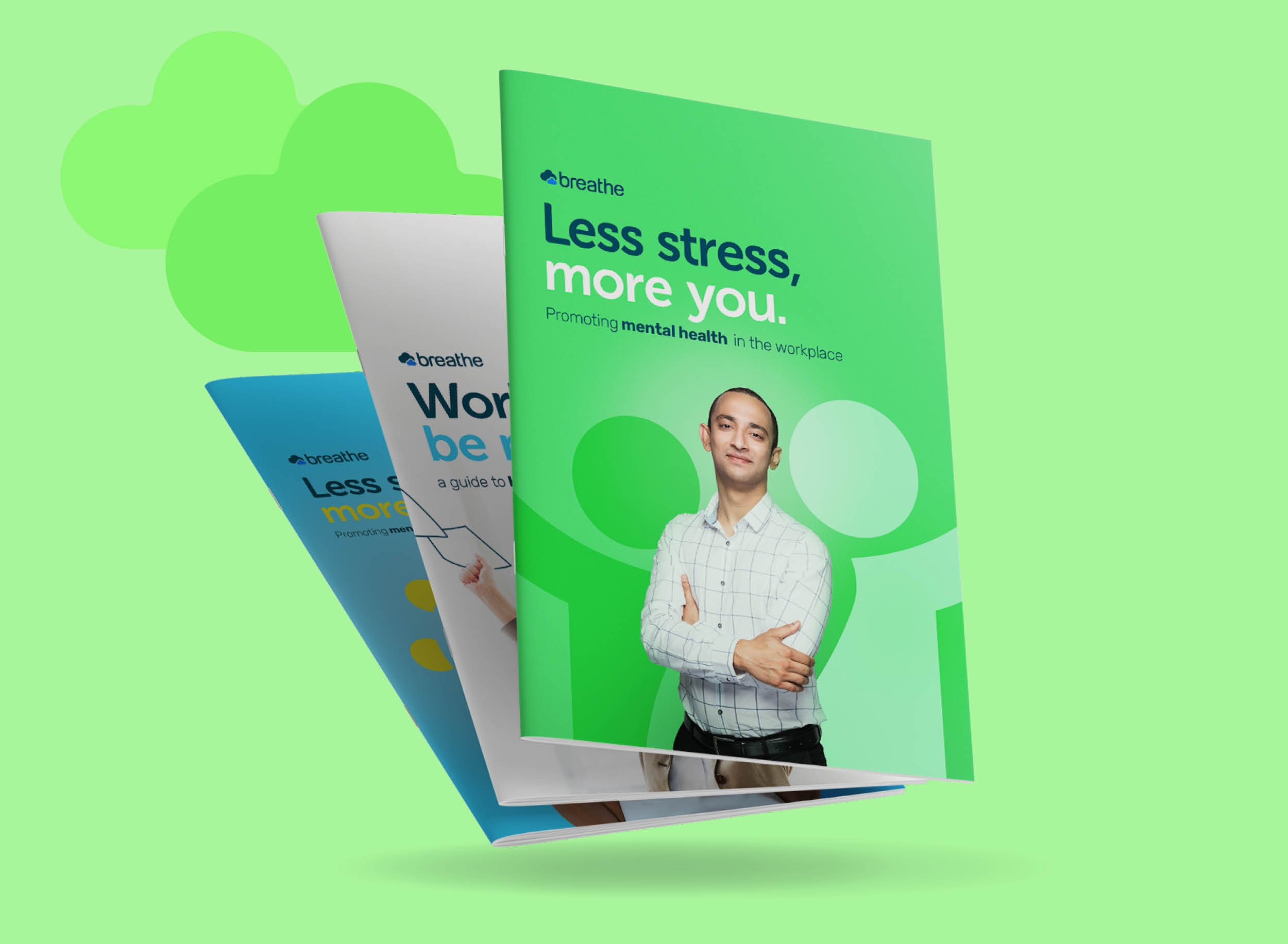
Colour palette
We created a single, consistent colour palette that incorporated accessibility guidance and limited colour use per-item. We took the opportunity to express a more engaging side to the brand by tweaking the colours to make them more just a touch more luminous.
Reclaiming the cloud
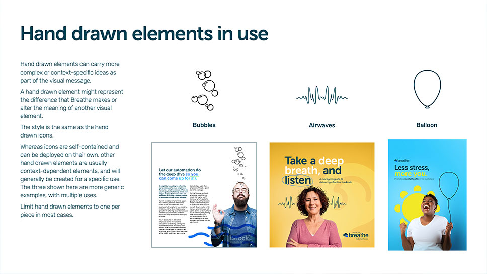
Breathe’s logo ‘cloud’ shape was ubiquitous across all comms. By creating an alternative suite of geometrically similar shapes – a fingerprint for personalisation, a sun for happiness – for more targeted expressions of Breathe’s benefits, we gave them a route to reclaiming the power of the Cloud.
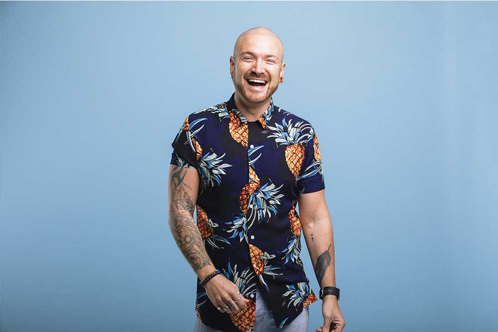
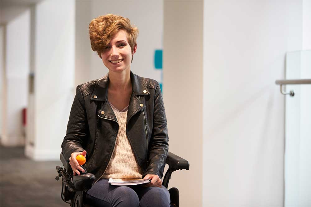
Photography
Their sector is awash with glossy stock model photography. As a point of differentiation and engagement, we suggested using more relateable photography. By featuring more diverse groups and lifestyles, Breathe could embody their values of impact, difference and criticality.